This vibrant mixed-media collage blends portrait photography with hand-cut paper, paint splashes, and retro graphic elements to create a surreal, modern artwork. A central female subject faces three-quarter view, framed by torn paper edges, floral motifs, and geometric shapes in saturated teal, magenta, and gold. The composition balances organic textures — visible paper grain, brush strokes, and subtle halftone dots — with clean vector lines and negative space. Soft cinematic rim light and shallow depth of field keep the face detailed and emotive while surrounding elements float in layered dimension. Ideal for editorial design, album covers, and creative branding, this collage-style digital artwork conveys a bold, whimsical mood and handcrafted authenticity. Keywords: mixed-media portrait, surreal collage art, vibrant textures, editorial artwork, modern vintage design.
Prompt:
Ultra-detailed mixed-media collage portrait of a woman, three-quarter view, looking slightly off-camera. Combine high-resolution studio portrait photography with hand-cut paper collage, torn paper edges, brush paint splashes, floral cutouts, and geometric vector shapes. Color palette: saturated teal, deep magenta, warm gold accents, soft cream background with subtle gradients. Textures: visible paper grain, canvas brush strokes, halftone dots, subtle film grain and paper shadowing for depth. Lighting: soft cinematic rim light, gentle key light on face, shallow depth of field to keep facial features crisp while background layers softly blur. Composition: central figure layered with overlapping elements (vintage postage stamps, small botanical illustrations, ink sketches, crumpled paper folds) arranged asymmetrically; negative space on right for balance. Style: contemporary surreal mixed-media, editorial magazine aesthetic, handcrafted feel, cinematic color grading, high detail, 8k resolution, photorealistic skin with painterly overlays, delicate bokeh highlights. Include fine line ink doodles and minimal gold foil texture highlights. Render with realistic shadows between layers, soft directional light, and natural skin tones. –v 5 –ar 1:1 –q 2 –stylize 750
This vibrant retro-futuristic portrait collage showcases a bold, colorful composition ideal for generative art and AI image creation. The piece features a striking central portrait of a young woman layered with torn paper textures, geometric shapes, neon gradients, and floral accents. High-contrast lighting, soft film grain, and surreal color shifts create a dreamy, cinematic mood. Use this image as inspiration for digital collage, MidJourney, Stable Diffusion, or DALL·E prompts to generate high-detail, editorial-style artwork with a modern vintage twist. The composition balances organic floral motifs and hard-edged geometry, producing an energetic, stylish visual statement that works well for album covers, posters, and creative branding. Optimize further by adjusting palette, camera angle, and texture levels for consistent results in generative workflows.
A vivid retro-futuristic portrait collage of a young woman centered in frame, editorial fashion pose, soft confident expression. Layered composition with torn paper edges, geometric shapes (triangles, circles), and delicate floral elements (roses, peonies) interwoven around the figure. Neon gradient palette: magenta, cyan, warm gold and soft pastel teal. Strong cinematic rim and key lighting creating high contrast with gentle film grain and subtle bokeh. Mixed media textures: paper fibers, paint splatter, halftone dots, and subtle watercolor washes. Stylized photorealism blended with graphic design — crisp facial detail, realistic skin tones, glossy hair highlights, and slightly desaturated background to make colors pop. Balanced composition with negative space, soft shadows, and a 35mm editorial crop, high resolution, ultra-detailed, cinematic color grading, moody yet energetic atmosphere. Keywords: vibrant, collage, retro, neon, floral, geometric, cinematic lighting, mixed media, high detail, editorial fashion.
Creating professional data visualizations used to require hours of manual formatting and design expertise. Today’s AI graph generators eliminate this friction by automatically analyzing your data, recommending optimal chart types, and applying professional styling in seconds.
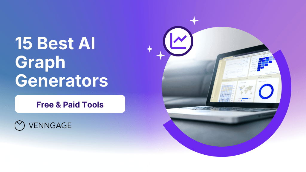
This comprehensive guide examines the top 15 AI-powered visualization tools available in 2025, covering free options for individual users to enterprise solutions for complex business intelligence needs.
Generative AI is the most powerful tool for creativity that has ever been created. It has the potential to unleash a new era of human innovation.
AI is likely to be either the best or worst thing to happen to humanity.
Stephen Hawking, Theoretical Physicist & Author, Source
What are AI graph generators and how do they work?
AI graph generators are intelligent software tools that transform raw data into professional visualizations using machine learning algorithms. These platforms analyze your dataset’s structure, identify patterns and relationships, then automatically suggest the most effective types of graphs and visual formatting.
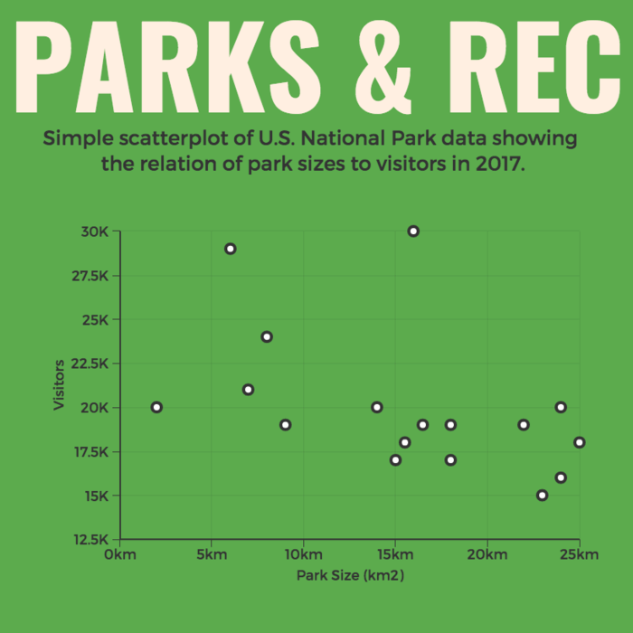
For example, AI tools might recommend using a scatter plot to highlight patterns, something you can customize instantly with this scatter plot template.
Core AI capabilities include:
Automatic chart type selection – Algorithms determine whether your data works best as bar charts, line graphs, scatter plots, or other visualization types
Smart color and styling – AI applies color theory and design principles to ensure charts are both attractive and accessible
Natural language processing – Many tools accept plain English descriptions like “show quarterly sales trends” and generate appropriate visualizations
Pattern recognition – Advanced algorithms identify outliers, trends, and correlations that might be missed in manual analysis
Dynamic formatting – Charts automatically adjust styling, legends, and layouts based on data complexity and intended audience
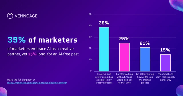
The technology has evolved significantly from basic charting tools. Modern AI generators can handle complex multi-dimensional datasets, suggest interactive elements, and even provide narrative explanations of what the data reveals. In fact, 58% of enterprises have adopted interactive dashboards powered by AI.
AI is not about replacing people — it’s about augmenting human potential.
Why use AI graph generators instead of traditional tools?
Traditional charting software requires users to manually select chart types, configure formatting, and apply design principles. AI generators automate these decisions based on data science best practices and visual design principles.
AI applies visualization best practices consistently
Reduces human error in chart type selection
Ensures accessibility standards are met
Maintains brand consistency across all visualizations
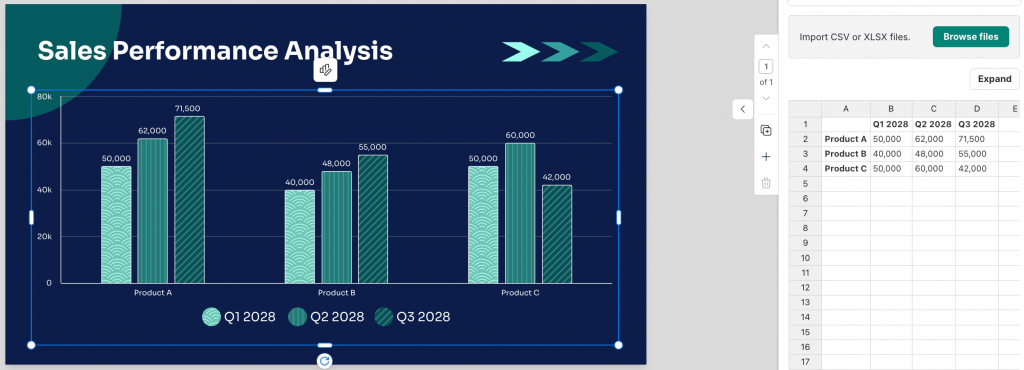
You just have to enter accurate data, and the AI will handle the rest like in this sales performance analysis graph, where you can upload CSV/XLSX files or edit data directly in Venngage’s design editor.
Accessibility benefits:
No design expertise required
Intuitive interfaces suitable for non-technical users
Natural language input options
Built-in templates for common business scenarios
For instance, Venngage uses its accessibility tools to apply inclusive design standards to every project while giving you 100% control to customize your graphs with its “My Brand Kit” feature.
Companies that successfully implement AI-led processes will be able to reduce their workforces by 95%+ while maintaining or increasing output. We’ll see examples of $100M+ companies operating with just two or three people assisted by agentic AI systems.
While most AI tools for graphic design offer broader creative features, specialized AI graph generators focus on turning data into charts to help you complement your visual storytelling.
1. Tableau with AI-powered analytics
Tableau remains the gold standard for professional data visualization, now enhanced with sophisticated AI capabilities that make complex analysis accessible to business users. Over 120,000 organizations use Tableau across the world, marking an 18% increase compared to 2023.
Key AI features:
Ask data functionality – Type questions in plain English and receive instant visualizations
Explain data feature – AI automatically identifies and explains statistical outliers and unexpected values
Automatic dashboard creation – Suggests optimal dashboard layouts based on data relationships
Smart recommendations – Proposes additional charts and analyses based on current visualizations
Best for: Enterprise teams, data analysts, and organizations with complex reporting requirements
Strengths: Handles large datasets efficiently, extensive customization options, robust collaboration features
Limitations: Steeper learning curve, higher cost, may be overpowered for simple charting needs
Pricing: Creator license starts at $70/month, Viewer licenses at $12/month
2. Microsoft Power BI with AI insights
Power BI’s AI integration focuses on automated business intelligence, making advanced analytics accessible to everyday business users through natural language interfaces and smart insights.
Key AI features:
Q&A visual – Natural language querying that understands business terminology
Quick insights – Automatically scans data to identify interesting patterns and trends
Key influencers visual – AI identifies factors driving specific business outcomes
Decomposition tree – Automatically suggests drill-down paths for root cause analysis
Best for: Microsoft-centric organizations, business analysts, teams needing integrated BI solutions
Strengths: Seamless Office 365 integration, cost-effective licensing, strong mobile experience
Limitations: Less flexibility than specialized tools, limited advanced statistical capabilities
Pricing: Power BI Pro at $10/user/month, Premium at $20/user/month
3. Venngage’s AI Graph Generator
Venngage AI Graph Generator combines powerful AI automation with intuitive design tools, making professional data visualization accessible to users without technical or design backgrounds.
Key AI features:
Smart chart recommendations – AI analyzes data patterns and suggests optimal visualization types
Automatic brand styling – Applies consistent colors, fonts, and design elements across all charts
One-click data import – Seamlessly connects with Excel, Google Sheets, and CSV files
Intelligent formatting – Automatically adjusts layouts, legends, and labels for maximum clarity
Template optimization – AI suggests the best templates based on data type and intended use
You can begin with a simple blank line graph template and let the AI graph generator populate it with your data.
Best for: Business professionals, marketers, content creators, and teams needing quick professional visualizations
Limitations: Less suited for complex statistical analysis, fewer advanced customization options than enterprise tools
Pricing: Free plan available with basic features, paid plans start at $19/month
4. Google Charts with Machine Learning integration
Google Charts leverages Google’s machine learning capabilities to provide intelligent visualization recommendations while maintaining the simplicity and accessibility the platform is known for.
Key AI features:
Automatic chart type suggestions – Analyzes data structure to recommend optimal visualization approaches
Smart defaults – AI applies appropriate scaling, formatting, and styling based on data characteristics
Predictive visualizations – Uses historical data patterns to suggest trend projections
Accessibility optimization – Automatically ensures charts meet web accessibility standards
Best for: Google Workspace users, web developers, teams needing embedded visualizations
Strengths: Free to use, excellent integration with Google services, lightweight and fast-loading
Limitations: Limited design customization, fewer chart types than specialized tools
Pricing: Completely free
5. Plotly with Dash intelligence
Plotly combines interactive visualization capabilities with AI assistance, making it particularly valuable for data scientists and technical teams who need both automation and granular control.
Key AI features:
Interactive element suggestions – AI recommends optimal user interactions based on data complexity
Layout optimization – Automatically arranges multiple charts for maximum comprehension
Performance recommendations – Suggests optimizations for large datasets and real-time applications
Statistical insight generation – Identifies correlations and patterns worth highlighting
Best for: Data scientists, researchers, developers building interactive dashboards
Strengths: Highly interactive visualizations, supports multiple programming languages, excellent for real-time data
Limitations: Requires technical expertise, steeper learning curve for business users
Pricing: Free tier available, paid plans start at $420/year
How to create graphs with AI: Step-by-step process
Creating effective visualizations with AI graph generators follows a consistent workflow that maximizes the technology’s capabilities while ensuring accurate, meaningful results.
Step 1: Data preparation and upload
Clean and organize your data in spreadsheet format
Ensure column headers clearly describe the data they contain
Remove or flag any missing values or outliers
Consider the story you want your data to tell
Step 2: AI-powered analysis and recommendations
Upload your dataset to your chosen AI graph generator
Review the AI’s automatic analysis of data types and relationships
Examine suggested chart types and visualization approaches
Consider the AI’s insights about patterns and trends
Step 3: Customization and refinement
Select from AI-recommended chart types or explore alternatives
Apply AI-suggested styling and color schemes
Adjust formatting based on your audience and context
Add titles, labels, and annotations for clarity
Step 4: Validation and optimization
Verify that the visualization accurately represents your data
Test readability across different devices and formats
Ensure the chart effectively communicates your intended message
Make final adjustments to styling and formatting
In a few years, everyone will have their own personal AI — just like we all have smartphones today.
Canva’s approach to AI visualization emphasizes design aesthetics alongside data accuracy, making it ideal for content creators who need visually appealing charts for marketing and communication purposes.
Key AI features:
Design-first recommendations – Suggests chart types that balance data clarity with visual appeal
Automatic color coordination – AI selects colors that work well together and maintain brand consistency
Template personalization – Adapts design templates based on data characteristics and intended use
Social media optimization – Automatically formats charts for different social platforms
Best for: Content marketers, social media managers, small business owners, educators
Limitations: Less suitable for complex data analysis, limited statistical chart types
Pricing: Free plan with basic features, Canva Pro at $12.99/month
7. Infogram’s smart visualization assistant
Infogram specializes in infographic-style data visualizations, with AI capabilities focused on creating engaging, shareable content that communicates data insights effectively to broad audiences.
Key AI features:
Content type recommendations – Suggests whether data works better as charts, infographics, or interactive content
Audience-aware styling – Adjusts complexity and design based on intended audience
Engagement optimization – AI suggests interactive elements that increase user engagement
Multi-format output – Automatically optimizes visualizations for web, print, and social sharing
Best for: Content creators, journalists, marketing teams, non-profit organizations
Strengths: Strong focus on storytelling, excellent template variety, good social media integration
Limitations: Less suitable for detailed analytical work, limited statistical capabilities
Pricing: Free plan available, paid plans start at $25/month
8. QuickChart API for developers
QuickChart provides programmatic chart generation with AI optimization, making it valuable for developers who need to generate visualizations automatically within applications or workflows.
Key AI features:
Automatic formatting optimization – AI ensures charts are readable across different sizes and contexts
Performance tuning – Optimizes chart rendering for speed and resource efficiency
Style consistency – Maintains visual consistency across automatically generated charts
Error handling – AI detects and suggests corrections for common data visualization problems
Best for: Software developers, SaaS applications, automated reporting systems
Strengths: Simple API integration, handles high-volume generation, excellent performance
Pricing: Free tier for basic usage, paid plans start at $40/month
Best AI graph generators for business intelligence
9. Sigma computing’s natural language analytics
Sigma Computing represents the next generation of business intelligence tools, where AI enables conversational interactions with data through natural language processing and automated insight generation.
Key AI features:
Conversational data exploration – Ask business questions in plain English and receive relevant visualizations
Automatic insight detection – AI continuously monitors data for significant changes and trends
Smart drill-down suggestions – Recommends logical next steps for data exploration
Business context awareness – Understands industry-specific metrics and KPIs
Best for: Enterprise business analysts, executive teams, organizations democratizing data access
Strengths: Intuitive natural language interface, powerful collaboration features, cloud-scale performance
Limitations: Higher cost, requires organizational data governance, learning curve for advanced features
Pricing: Custom enterprise pricing based on usage and features
10. Zoho Analytics with AI assistant
Zoho Analytics integrates AI capabilities across the entire business intelligence workflow, from data preparation through visualization and insight generation, making advanced analytics accessible to small and medium-sized businesses.
Key AI features:
Zia AI assistant – Natural language interface for data queries and analysis
Automated report generation – AI creates comprehensive reports based on data patterns
Anomaly detection – Automatically identifies unusual patterns that require attention
Predictive analytics – Uses historical data to forecast future trends
Best for: Small to medium businesses, teams using Zoho’s business suite, non-technical analysts
Strengths: Comprehensive business suite integration, affordable pricing, user-friendly interface
Limitations: Less powerful than enterprise BI tools, limited advanced statistical capabilities
Pricing: Starting at $22/month for 2 users, scales with additional users and features
Top AI tools for interactive data visualization
11. Flourish Studio’s storytelling AI
Flourish Studio focuses on animated and interactive visualizations, with AI capabilities designed to enhance data storytelling through motion, interaction, and narrative flow.
Key AI features:
Animation sequence optimization – AI suggests the most effective order and timing for animated elements
Interaction design recommendations – Proposes user interactions that enhance data comprehension
Story flow assistance – Helps structure multiple visualizations into coherent narratives
Accessibility automation – Ensures interactive elements work across devices and abilities
Best for: Data journalists, educators, presentation creators, storytellers
Limitations: Requires more setup time, less suitable for simple static charts
Pricing: Free for public projects, paid plans start at $69/month
12. DataWrapper’s publication-ready AI
DataWrapper specializes in creating charts optimized for publication and web embedding, with AI features focused on readability, accessibility, and professional presentation standards.
Key AI features:
Publication optimization – Automatically adjusts formatting for different publication contexts
Accessibility compliance – AI ensures charts meet international accessibility standards
Multi-format adaptation – Optimizes visualizations for web, print, and mobile viewing
Style guide enforcement – Maintains consistent styling across all organizational charts
Best for: Journalists, publishers, news organizations, professional content creators
Strengths: Publication-quality output, excellent accessibility features, clean, professional design
Limitations: Limited design customization, fewer interactive features
Pricing: Free for public charts, paid plans from €599/month for organizations
Advanced AI visualization platforms
13. Adobe Express chart creator with AI design
Adobe Express leverages Adobe’s design expertise and AI capabilities to create visually stunning charts that maintain data integrity while maximizing aesthetic impact and brand consistency.
Key AI features:
Design principle automation – Applies professional design rules automatically
Brand consistency enforcement – Ensures all visualizations align with established brand guidelines
Creative enhancement suggestions – Recommends visual elements that improve engagement without compromising data clarity
Multi-format optimization – Automatically adapts designs for different uses and platforms
Best for: Design teams, brand-focused organizations, creative professionals, marketing departments
Strengths: Superior design quality, excellent brand management, Creative Cloud integration
Limitations: Higher cost, may prioritize aesthetics over analytical depth
Pricing: Free plan available, paid plans start at $9.99/month
14. FusionCharts with intelligent recommendations
FusionCharts combines comprehensive charting capabilities with AI-powered recommendations, making it valuable for enterprise applications that require both breadth of chart types and intelligent automation.
Key AI features:
Chart type intelligence – Analyzes data complexity to recommend optimal visualization approaches
Performance optimization – AI tunes chart rendering for different data volumes and user scenarios
Integration recommendations – Suggests best practices for embedding charts in applications
User experience optimization – Recommends interactive features based on audience and use case
Best for: Enterprise software developers, dashboard creators, complex application builders
Limitations: Requires technical implementation, higher cost for full feature set
Pricing: Developer licenses start at $497, enterprise pricing varies
15. Chart.js with AI enhancement plugins
Chart.js provides an open-source foundation that can be enhanced with various AI plugins and extensions, offering maximum flexibility for developers who want to incorporate intelligent visualization capabilities into custom applications.
Key AI features:
Plugin ecosystem – Various AI extensions for automatic styling, optimization, and recommendations
Custom algorithm integration – Ability to incorporate proprietary AI models and logic
Performance AI – Plugins that optimize rendering and user experience automatically
Community-driven enhancements – Continuously evolving AI capabilities through developer community
Best for: Developers wanting maximum control, custom application builders, organizations with specific AI requirements
Strengths: Complete customization freedom, no licensing costs, extensive community support
Limitations: Requires significant development expertise, no built-in business intelligence features
Pricing: Free open-source library, costs vary for commercial AI plugins
How to choose the right AI graph generator for your needs
Selecting the optimal AI graph generator depends on your specific requirements, technical capabilities, and intended use cases. Consider these key factors when evaluating options:
For business reporting and analysis:
Prioritize tools with strong AI insights and natural language capabilities
Consider integration with existing business systems and data sources
Evaluate collaboration features and sharing capabilities
Look for platforms that understand business metrics and KPIs
For content creation and marketing:
Focus on design quality and visual appeal automation
Ensure templates and styling options align with brand requirements
Consider social media optimization and multi-format output
Evaluate ease of use for non-technical team members
For technical and scientific applications:
Prioritize statistical accuracy and advanced chart types
Look for programming language integration and API access
Consider real-time data handling and performance optimization
Evaluate customization options and extensibility
For enterprise and large-scale deployment:
Assess security features and compliance capabilities
Consider user management and administrative controls
Evaluate scalability and performance under load
Review integration options with existing enterprise systems
Getting maximum value from AI graph generators
Data preparation best practices:
Clean and structure your data before uploading
Use clear, descriptive column headers
Remove or properly handle missing values
Consider the story you want your data to tell
Working effectively with AI recommendations:
Review multiple AI-suggested chart types before selecting
Understand why the AI recommends specific visualizations
Combine AI automation with human judgment about audience needs
Test different approaches for complex datasets
Optimization strategies:
Regularly review and update visualization templates
Gather feedback from chart viewers to improve effectiveness
Stay updated on new AI features and capabilities
Integrate AI graph generation into broader workflow automation
The landscape of AI graph generators continues evolving rapidly, with new capabilities and improvements appearing regularly. The most successful users combine AI automation with human insight, using these tools to handle technical complexity while applying domain expertise to ensure visualizations communicate effectively and drive meaningful action.
By understanding the strengths and limitations of different AI graph generators, you can select tools that align with your specific needs and maximize the value of your data visualization efforts. Whether you need quick business charts, complex analytical visualizations, or engaging content graphics, the right AI-powered tool can dramatically improve both the efficiency and effectiveness of your data communication.
Ever found yourself wondering, “Wait… is this a graph or is it a chart?” For most of us, the terms graph and chart seem interchangeable, but there’s a clear and important difference.
Here’s the simplest explanation:
A chart is an umbrella term for all types of data visualization—think of it as your “visual data toolbox.” A graph is a specific type of chart that shows the relationship between two (or more) variables, usually using points and lines or bars.
So:
Every graph is a chart, but not every chart is a graph.
Use “chart” when referring to any visual summary of data and “graph” when you want to highlight how variables relate or change together.
Choosing the right visual doesn’t just make your data easier to understand—it helps your audience remember it and take action. In fact, visual aids can boost learning retention by up to 42%.
As Dante Vitagliano puts it, “Data visualization is the language of decision making. Good charts convey information; great charts enable, inform, and improve decision making.”
Whether you’re preparing a business report, pitching to stakeholders or just trying to jazz up your latest blog post, knowing the difference is crucial.
In this complete (and jargon-free) guide, you’ll learn:
The key differences between graphs and charts
When to use each one (with plenty of visual examples)
The most popular types of graphs and charts (an AI graph tool to help you)
Design tips and actionable DOs and DON’Ts
Answers to all your burning “graph vs chart” FAQs
Ready to become a data visualization pro? Let’s dive in.
What’s the difference between a graph and a chart, anyway?
Let’s clear up one of the most stubborn myths in data visualization: graphs and charts are not the same thing.
A graph uses mathematical coordinates and axes to plot data points, showing precise relationships between variables through visual positioning.
A chart encompasses all visual data representations, including non-mathematical formats like pie slices, pictographs, flowcharts and tables—designed primarily for quick comparison and understanding rather than mathematical precision.
Here’s how it breaks down:
What is a graph?
A graph is a mathematical visualization that uses coordinate systems (typically X and Y axes) to plot data points in precise positions. Graphs are built on mathematical foundations and are ideal when you need to:
Show exact relationships between variables
Display continuous data changes
Reveal mathematical patterns or correlations
Present data that can be measured on specific scales
The key characteristic of a graph is its reliance on mathematical positioning—each point, line or bar has a specific coordinate that represents actual data values.
79% of companies use graphs in their annual reports, with 65% graphing at least one key financial variable. Common types include line graphs, bar graphs and scatter plots.
Pro Tip: If you see axes (X and Y), you’re probably looking at a graph. For a full breakdown of different graph types and when to use them, check out our complete guide to graphs.
What is a chart?
A chart is a broad category that covers all types of visual data representations, whether they use mathematical coordinates or not. Charts focus on quick comprehension and visual impact rather than strict mathematical precision. As data expert Dante Vitagliano notes, “Good charts convey information; great charts enable, inform and improve decision making.”
Examples include:
Pie charts: proportional slices, not coordinate-based
Pictographs: icon-based representations
Flowcharts: process diagrams
Organizational charts: hierarchical structures
Tables: structured data displays
And yes, graphs too!
Think of charts as a complete toolkit for turning data into visuals that anyone can understand.
Graphs vs charts: real-world examples
Seeing the difference in action makes it much clearer. Here are some practical scenarios:
Example 1: Showing sales projection over time
Graph: Line Graph
Purpose: Visualizes monthly sales growth, highlighting trends and fluctuations.
Chart: Bar chart
Purpose: Compares total sales for each product category, making it easy to see which categories perform best.
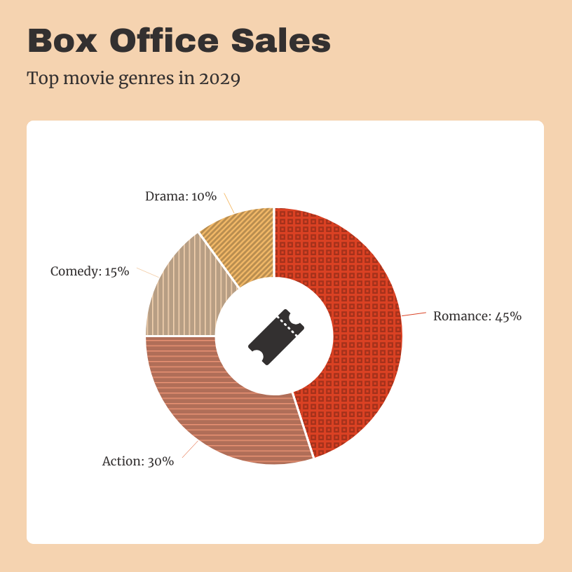
Example 2: Revenue breakdown
Chart: Pie chart
Purpose: Illustrates how total box office revenue is distributed across different movies or genres, showing each film’s contribution to the overall earnings. Notably, 44% of participants found pie or doughnut charts the fastest to understand.
Example 3: Relationship between marketing spend and sales
Graph: Scatter Plot
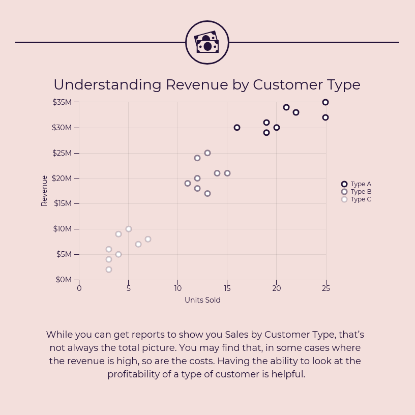
Purpose: Plots revenue against customer type to reveal patterns or trends, helping identify which customer segments contribute most to overall earnings.
To master data visualization, it helps to understand the variety of options available. Check out our guide to types of graphs and charts for examples and practical tips.
Quick reference: Types of graphs and charts (with templates!)
With the basics down, let’s look at the most popular graph and chart types—and when to use them.
Best for: Scheduling and creating timelines for project management.
Example template:
Choosing between graphs and charts: Leveraging AI for smarter decisions
Deciding between a graph and a chart depends on your data and your communication goal. Here’s how to make the right call—and how AI can revolutionize this decision-making process.
Use a graph to:
Show trends over time: Line graphs are perfect for tracking changes, such as monthly sales or website visitors.
Display relationships or correlations: Scatter plots reveal how two variables interact (e.g., marketing spend vs. sales).
Analyze patterns or distributions: Area graphs and histograms help you understand how data is spread or grouped.
Use a chart to:
Compare parts of a whole:Pie and doughnut charts visualize proportions, like budget allocations.
Rank or compare categories:Bar/column charts make it easy to see which categories stand out.
Visualize processes or flows:Flowcharts and Gantt charts outline steps or timelines.
Simplify big numbers or concepts:Pictographs use icons to make statistics more relatable.
How AI revolutionizes chart and graph selection
Modern AI systems have transformed the traditionally complex process of choosing the right visualization. Research from Microsoft and academic institutions shows that AI can analyze data characteristics and automatically recommend the most effective visualization types based on mathematical algorithms that consider data structure, variable relationships and communication objectives.
Here’s how AI makes these decisions:
Data structure analysis: AI algorithms analyze datasets to identify patterns, variable types (categorical vs. numerical), data distribution and relationships between variables. For example, if AI detects time-series data with continuous numerical values, it will prioritize line graphs or area charts.
Communication goal detection: Advanced AI systems can interpret user intent from natural language descriptions. When you describe wanting to “compare sales across regions,” the AI recognizes this as a categorical comparison task and suggests bar charts or column charts.
Statistical pattern recognition: AI excels at identifying correlations, distributions and trends within large datasets that might be overlooked by human analysts. This allows for more sophisticated visualization recommendations that reveal hidden insights.
Contextual optimization: Modern AI visualization tools like Microsoft’s Data Formulator use large language models to process user specifications and generate appropriate chart configurations through iterative refinement.
Real-world AI decision making in action
Tools like Venngage’s AI Graph Generator exemplify this technological advancement. When you upload a dataset or describe your visualization needs, the AI analyzes multiple factors simultaneously:
Variable types and relationships in your data
Your stated objective (comparison, trend analysis, proportion display)
Best practices from visualization research
Audience considerations based on your description
For instance, if you upload sales data across multiple quarters and mention wanting to “show growth trends,” the AI will likely recommend a line graph.
But if the same data includes multiple product categories and you want to “compare performance,” it might suggest a grouped bar chart instead.
The science behind AI chart selection
Recent academic research in generative AI for visualization shows that AI systems use four major stages for visualization tasks: data enhancement, visual mapping generation, stylization and interaction. These systems can process different types of data structures—sequence, tabular, spatial and graph data—to determine optimal visualization approaches.
The decision-making process involves:
Automated data analysis: AI algorithms can automatically detect and correct errors in datasets, such as missing values or inconsistencies, ensuring that the data is accurate and ready for visualization.
Pattern recognition: AI algorithms excel at identifying patterns and correlations within large datasets that might be overlooked by human analysts, integrating these insights into visualizations to reveal hidden trends and relationships.
Intelligent recommendations: Rather than memorizing complex rules for choosing the right chart, you can describe what you want to understand about your data in natural language and the AI will help you select and create the optimal visualization.
Quick table summary
Purpose
Use a Graph
Use a Chart
AI Recommendation Factor
Show change over time
✔
Temporal data structure
Compare categories
✔
Categorical variables
Show correlation
✔
Two continuous variables
Show parts of a whole
✔
Proportional data
Display data on axes
✔
Mathematical relationships
Show a process/steps
✔
Sequential/hierarchical data
Pro Tip: If your visual uses axes (X and Y), it’s almost always a graph. Modern AI tools can make this determination automatically by analyzing your data structure and intended communication goals.
How to choose the right visual: 5 questions to ask
Now that you know what each visual does, here’s how to select the best one for your project:
What story am I trying to tell? Are you comparing, showing a trend, illustrating proportions or mapping a process?
What kind of data do I have? Is it categories (chart), numbers over time/relationship (graph) or process steps (flowchart)?
Who is my audience? Executives often prefer simple charts; analysts may want detailed graphs. Executives prefer tables about 52% of the time, while analysis-oriented roles lean toward charts.
How much detail do I need? Less is often more—focus on clarity.
What will make my point stand out fastest? Use color, icons or bold numbers (but be consistent!).
As Monika Piekarska notes, “Data visualization is powerful. Still, data storytelling is what drives decision-makers. People take action when they interact with a data-evidenced proof of the story.”
A well-designed visual amplifies your message. Keep these tips in mind:
Stick to a clean grid layout: Use alignment tools to keep elements organized.
Embrace negative (white) space: Don’t crowd your data—let it breathe.
Limit your palette: Two or three main colors plus neutrals are enough.
Label axes and sections: Make your chart understandable even without extra explanation.
Choose readable, on-brand fonts: Avoid hard-to-read or unprofessional fonts.
Use icons and visuals sparingly: When you do, keep style and color consistent.
Common mistakes and how to avoid them
As Caroline Lee says, “Data visualization is a great way to simplify data and show it in a form that is understandable, insightful, and actionable.”
But even experienced pros can stumble, so watch out for these common pitfalls:
Using the wrong type: For example, don’t use a pie chart to show trends. Always match your visual to your data’s story.
Overloading with data or labels: Focus on the essentials and offer details-on-demand if needed.
Illegible fonts or colors: Prioritize contrast and readability.
Unnecessary 3D effects or “chartjunk”: Keep visuals flat, clean, and focused.
Forgetting axis scales or units: Always label axes and include reference points.
Pro Tip: Simplify! If your audience can’t grasp your visual in three seconds, it’s too complex.
FAQs: Graph vs chart
What’s the main difference between a graph and a chart?
A graph specifically shows relationships between two or more variables (think: how A changes with B, often with plotted points or lines on axes). A chart is a broader term for any visual data summary (bar, pie, pictograph, timeline, etc.).
Can a bar graph also be called a bar chart?
Yes! Bar graphs and bar charts are generally used interchangeably—they compare different quantities across categories. If axes are involved, some call it a graph; in dashboards, “bar chart” is often favored.
Which is best for showing parts of a whole?
Charts (like pie or doughnut charts) excel here. Graphs rarely display proportionate shares directly.
When should I use a scatter graph?
Whenever you want to visualize the relationship between two continuous numeric variables, great for seeing if two things rise or fall together (correlation).
Do professionals care about the difference?
Absolutely. The distinction helps teams discuss and pick the best format for accuracy and clarity. It can also impact how people interpret your message.
Key takeaways & next steps
Think of it this way: graphs show relationships, trends, or changes between numeric values—usually plotted on axes—while charts cover any visual summary of data, from comparisons to processes. Knowing the difference helps you pick the right visual for your story.
The right chart or graph makes your data easier to understand and easier to remember. As Brie E. Anderson puts it, “Data visualization helps to bridge the gap between numbers and words.”
Design really matters. The best visuals are simple, focused, and easy on the eyes—no clutter, no distractions.
The good news? Venngage’s chart and graph templates make creating professional, impactful visuals easy, even if you don’t have a design background.
Here’s how to take the next step:
Bring your reports, pitches, or blog posts to life with Venngage’s graph generator.
Browse our library of ready-made visuals to find the perfect chart or graph for your next project.
Now you’re not just clear on the graph vs. chart debate, you’re ready to tell your data story like a pro.
Most marketers hate writing technical white papers.
After all, you’re not the subject matter expert (SME). You often have to chase down SMEs, simplify jargon and risk ending up with something that’s either too complex.
In this blog, I’ll walk you through the process of how to plan, research and write a technical white paper that speaks clearly to your audience and drives results without wasting your time.
What is a technical white paper?
A technical white paper is a data-driven guide that defines a complex challenge and outlines a solution. Brands use it to explain technical topics, show their product’s role or help decision-makers see the bigger picture.
For instance, businesses that cater to technical audiences like developers, UX designers or cybersecurity analysts use them to inform and persuade.
If you already have research insights, you can start with a template that organizes visuals and flow. Here’s an example: this template presents complex ideas with clarity and impact.
Key components of a technical white paper
A good technical white paper follows a structure that makes it easy for both technical and non-technical readers to follow the argument from start to finish.
Here’s how to write a technical white paper that works best across most scenarios.
1. Title and abstract
Your title should grab attention and show both the topic and the value. Avoid vague headlines like Improving Network Security. Instead, aim for specifics such as “Reducing Network Breaches by 45% Through Zero-Trust Architecture.”
Similarly, use your abstract like an elevator pitch: briefly state the problem, approach and outcome. Many readers decide whether to continue based on this alone.
Here’s a white paper example that quantifies risks and pulls readers to the next page:
2. Introduction
The introduction or problem statement should show why the topic matters. Use a data point to create urgency, e.g., “In 2025, manufacturing downtime rose 19% due to preventable equipment failures.”
This hooks readers and sets context. The template below does it well, framing the topic, highlighting the problem and hinting at the solution in one glance:
3. Background or context
Give your readers a good background to understand the technical landscape that you’re covering. That might include a historical perspective of the domain, relevant industry statistics or a teaser of your research findings.
The goal is to get readers to be on the same page before you dive deeper in the paper. Here’s an example:
4. Methodology or approach
This is a great place and opportunity for you to gain credibility. Explain the process you took to research the topic, the tools or models you used or why you chose them.
For example, if you tested a new algorithm, mention how you trained it, the data sources or how you validated the results. Keep it factual and transparent.
This template does exactly that:
5. Results or solution
Show outcomes and guide readers from problem to solution. It helps to structure this section so the readers see:
The problems you addressed
The specific actions you took
The results that followed
To make this section more compelling, use specific numbers or real-world examples. If you are promoting your product or service, this is a good opportunity for you to plug yourself. But be careful to position the value more than the pitch.
Here’s a template that allows you to do this:
6. Conclusion and call-to-action
Revisit the problem, the solution and the benefits in simple language. Ideally, you should also suggest a logical next step.
In a technical white paper, a call-to-action might point the readers to a detailed case study, book a technical consultation or review product documentation.
7. References and appendices
Back every claim with data, citations, standards or relevant datasets. Link supporting diagrams, code or test data in the appendix to avoid clutter.
This template presents conclusions, call-to-action and references neatly in one place:
Step-by-step guide to writing a technical white paper
To make this section concrete, I’ll work with a hypothetical example: Reducing API Latency by 30% for a Global SaaS Platform.
I’ll use this template:
Part 1: Pre-writing and planning
Step 1: Identify your audience and goal
Define the exact problem you’re solving and avoid vague statements.
Example: “Our solution helps businesses reduce their API response time from 400 ms to 280 ms within two release cycles.”
Then identify who will read your paper and what matters to them. For instance:
Backend engineers: concerned with scalability and fault tolerance.
QA specialists: focused on automated test coverage and regression risk.
Product managers: want to see the cost-benefit ratio and roadmap impact.
Set SMART objectives for the paper itself. For example:
Show benchmark comparisons pre- and post-optimization.
Provide implementation steps reproducible by other teams.
Deliver findings within 90 days of initiating the project.
All of this information is for your own planning. None of it has to actually go in the white paper design, at least not at this stage.
Here’s how I customized the above template to fit my topic:
Step 2: Gather and validate technical data
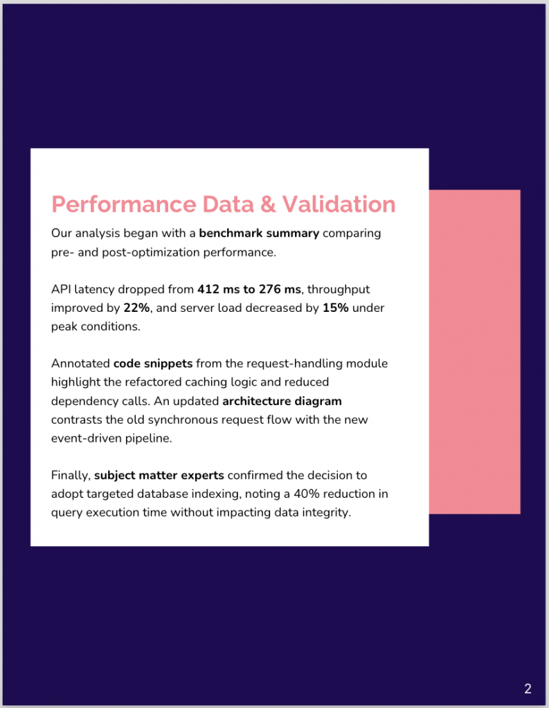
To make your paper credible, collect everything that supports your case:
Benchmark summary table showing latency in milliseconds, throughput in requests per second and server load percentages.
Code snippets for critical functions, with comments explaining purpose and complexity.
Architecture diagram to show the API request flow before and after optimization.
SME quotes validating why you chose a certain approach.
I added a new page in the template and added the above data:
Validation matters as much as collection. Cross-check all figures against original logs or monitoring tools to avoid publishing inaccurate data.
Step 3: Build and annotate your outline
Your outline is the skeleton that keeps you focused. It reflects the structure we covered in “Key components of a technical white paper.”
Under each heading, add bracketed notes for your references. For instance, here’s how I usually do it:
Results: “[Insert comparison table of latency before/after changes]”
This saves time during drafting and makes it clear to reviewers what goes where.
Part 2: Writing and post-writing
Step 4: Draft with technical precision
Each section should serve a clear purpose. In the case of my white paper topic, here are a few things I can do:
Background: Explain how global scaling introduced latency, citing internal SLA reports and published API performance guidelines.
Methodology: Audit database queries for inefficiencies; implement caching for repetitive calls; optimize load balancer configuration.
Implementation: Provide a snippet of the caching function with concise inline comments.
Results: Use a chart to show latency improvements per region; label axes and units. End with the takeaway: “Global average latency improved by 32% after optimizations.”
Here’s how I drafted the findings in my white paper:
Step 5: Peer review and revision
Don’t skip peer review; it’s where your claims meet credibility. Use an accuracy checklist to:
Confirm data tables match source logs.
Verify code compiles and passes all tests.
Ensure terminology aligns with industry standards.
Summarize SME feedback in bullets and note how you addressed each of them. Example: “<SME> suggested adding a diagram for multi-region failover; added to Methodology section.”
I always work on Google Docs, and here’s how my notes look like:
If your white paper’s target audience are engineers, for example, gaining their trust isn’t easy.
As Wendy Covey, CEO & Co-Founder of TREW Marketing, notes, engineers can instantly spot the difference between marketing fluff and content created by your technical team.
Step 6: Finalize layout and metadata
This is where design and polish cross paths with technical detail:
Check that your table of contents links to each section.
Add captions and alt text to every visual.
Include version number, publication date and author contact details.
Format citations consistently in IEEE or APA style.
And since I had the content ready and a clear plan, I designed a new white paper in Venngage in less than 40 minutes:
Best practices for writing a great technical white paper
A technical white paper works best when it feels like the smartest person in the room is explaining a problem step by step, without making you feel confused.
Here’s what separates a great technical white paper from one no one finishes reading.
1. Use clear, concise language
Think “engineering stand-up” instead of corporate euphemisms. For example, instead of writing “This process facilitates improved transactional throughput”, say “This speeds up transactions.”
If a term is industry-standard (e.g., Kubernetes pod or Kafka broker), keep it. If it’s company-specific slang (e.g., Real-Time Data Sync or Primary High-Availability Cluster), either elaborate it or drop it entirely.
Create a mini-glossary for acronyms and technical terms at the start or end. It saves the reader from having to Google “What’s MTTR again?” mid-way.
As film director and screenwriter Alexander Mackendrick put it, “If it can be cut out, then cut it out.” Removing the non-essential only makes what’s left stronger.
3. Use visuals strategically
A complex architecture described in text takes 250 words. But a labeled diagram takes 10 seconds for readers to understand.
A white paper is not a marketing brochure. “Our solution is industry-leading” means nothing without proof or relevance.
Replace flowery adjectives with measurable outcomes. For instance, instead of “world-class security”, say “encryption with a 0.01% false-positive rate.”
When writing a technical white paper, there is always a fine line to be trod between marketing and delivering thought leadership and technical information.
Treat the white paper like you’re going to get fact-checked (or worse, sued) for reporting false data. If you’re claiming a 30% performance gain, show the benchmark data, test environment and methodology.
Cite credible sources: official documentation, peer-reviewed journals, industry benchmarks.
Writing a technical white paper involves giving your message the space and clarity it deserves and in a way that readers’ brains can process.
1. Ideal length
For most technical audiences, 4,000 words (or ~6 to 12 pages) strikes the balance between depth and readability. On average, technical white papers tend to be 4,038 words long. That means most readers stay engaged at that length.
If your draft runs significantly longer, split it into separate white papers.
2. Formatting styles
The style you choose should match the conventions of your audience.
IEEE, common in engineering, uses numbered citations in square brackets and tightly numbered section headings, making it ideal for precision-heavy documents.
APA, on the other hand, favors a narrative structure that works better when explaining complex ideas in plain language. The style should guide your paper’s structure but not dictate the clarity of your arguments.
3. Table of contents, headings, numbering
Always include a linked Table of Contents for long PDFs or HTML documents. It helps readers navigate the paper easily.
Use numbered headings like “1.1 Introduction” or “2.1 Results” to keep readers oriented and write labels that convey exactly what follows. This helps readers follow the content logically.
4. Publication medium
PDFs preserve layout, diagrams and typography, making them the default for white papers. HTML works better online with hyperlinks, mobile-friendly formatting and engagement tracking.
You can publish both formats to serve readers who want to read online or download a printable version.
Related: Want to know which one is better for accessibility? Check out our PDF vs. HTML guide to see which format suits your audience.
How to start writing a technical white paper
The fastest way to stall out on a white paper is to open a blank document and wait for brilliance to strike you.
There’s no such thing as writer’s block. As long as your fingers can move over the keyboard, eventually it’ll segue into something.
Mary Kay Andrews, New York Times bestselling author, Source
Writing one isn’t about finding the perfect opening sentence. Instead, you should follow a clear roadmap and move through it without overthinking each step.
Outline first
Plan your outline before writing. Include introduction, background, problem, solution, results and conclusion. This is a foundation that helps spot gaps early and keeps the white paper focused.
Start with the problem
Start with a real, quantified problem your audience faces. Show its impact clearly so readers immediately understand why it matters before diving into the details.
Write sections in any order
If the introduction slows you down, skip it and start with the sections you know best. Writing out of order keeps momentum and avoids the “perfect intro” trap.
Once your draft is ready, pick a template to focus on content, not design, so you can polish and publish without spending days tweaking layouts.
FAQs about technical white papers
Here are quick answers to some of the most common questions people ask about writing a technical white paper.
1. What’s the difference between a white paper and a research paper?
A white paper explains a problem and proposes a solution, often for business or industry use. A research paper presents original findings or analysis, typically aimed at academic or scientific audiences.
2. How long should a technical white paper be?
Most technical white papers range between 4,000–6,000 words (i.e., between 6–12 pages). It’s a perfect length that allows enough depth to explain complex topics while keeping readers engaged throughout.
3. How much should I charge to write a white paper?
Freelance rates for technical white papers typically range from $3,000–$10,000, depending on complexity, research required and industry. Highly technical fields or niche expertise can command higher fees.
4. How much should I pay someone to write my paper?
Expect to pay $3,000–$10,000 for a professional technical white paper, depending on length, research depth and subject matter expertise. Highly specialized topics may cost more.
Free Template
Want to test out a technical white paper template like I did above? Use the free template below.
It’s clean, structured and the visual placeholders (in the pages that follow) make it easy to guide readers from problem to solution.
Ready to share your technical expertise?
You’ve got the data, the insights and the story that could move your industry forward. The only risk now is letting it sit in your files instead of shaping it into something people can use, share and learn from.
Every competitor with a half-baked PDF is already vying for your audience’s attention. Why not give them a reason to choose yours?
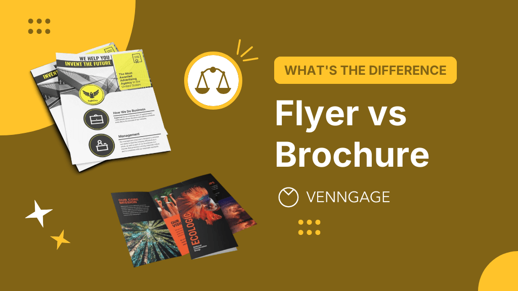
Most people can’t tell the difference between a flyer and a brochure. I couldn’t either, until a few years back. It’s usually not a big deal, unless you’re in marketing, where not knowing the difference can cost you money and credibility (or your job, if your boss is a bit dramatic).
We often use the terms interchangeably, but flyers and brochures are built for very different jobs. In this post, I’ll break down the differences between a flyer and a brochure, show when each format works best and give you clear direction so your next campaign is successful.
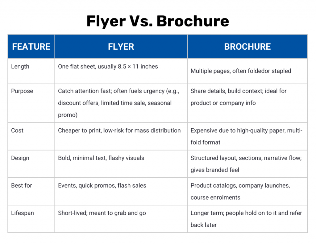
Key differences between a flyer and a brochure
Flyers work best for flash sales and quick promos, such as a gym offering 40% off memberships during Thanksgiving. Brochures, on the other hand, are better-suited for detailed storytelling and long-term decisions, like a real estate agency showcasing property listings, testimonials and financing options.
You shouldn’t choose one over the other based on looks or your personal preference. The difference often lies in the intent and the outcome you want out of each of them.
Here’s a quick comparison between the two:
What is a flyer?
A flyer is a single-page marketing piece meant to be scanned fast. Think of it as an announcement on a sheet of paper, printed or digital, that’s designed to catch the eye immediately.
It’s usually a one-sided or two-sided flat sheet. Most often printed on standard 8.5″ × 11″ paper.
The goal is immediate attention: advertise a sale, a gig, a quick event. Give it to hundreds or post it publicly.
Flyers are cheap per unit and disposable. You print fast and move on.
Here’s another example template that doubles as a sales promo and a product catalog:
You don’t have to design a flyer from scratch, especially if you’re not a professional designer. A better alternative is to choose the best flyer design software, pick the right flyer template and design one within just a few minutes.
You can say a brochure is a longer, more thorough version of a flyer. It’s a multi-fold or multi-page material meant to inform and persuade.
It folds. Common formats include tri-fold, bi-fold, z-fold, gate-fold or even saddle-stitched booklets.
It’s built to be read thoroughly, not just glanced at. It uses heavier paper stock, UV or gloss coating, often includes visuals and has organized sections.
You hand it to people that you know are already interested in what you offer. But don’t expect them to convert immediately. They might keep the brochure on desks, in hands or in handbags for days or weeks, until they make up their minds.
Brochures are more common in B2B, retail and tourism. You’ll see them at trade shows, in-store as catalogs or at visitor centers to showcase attractions and itineraries.
81% of marketers say print assets, like brochures, remain a core part of their marketing strategy.
You’ve probably picked up a tri-fold brochure like the one below more times than you can remember.
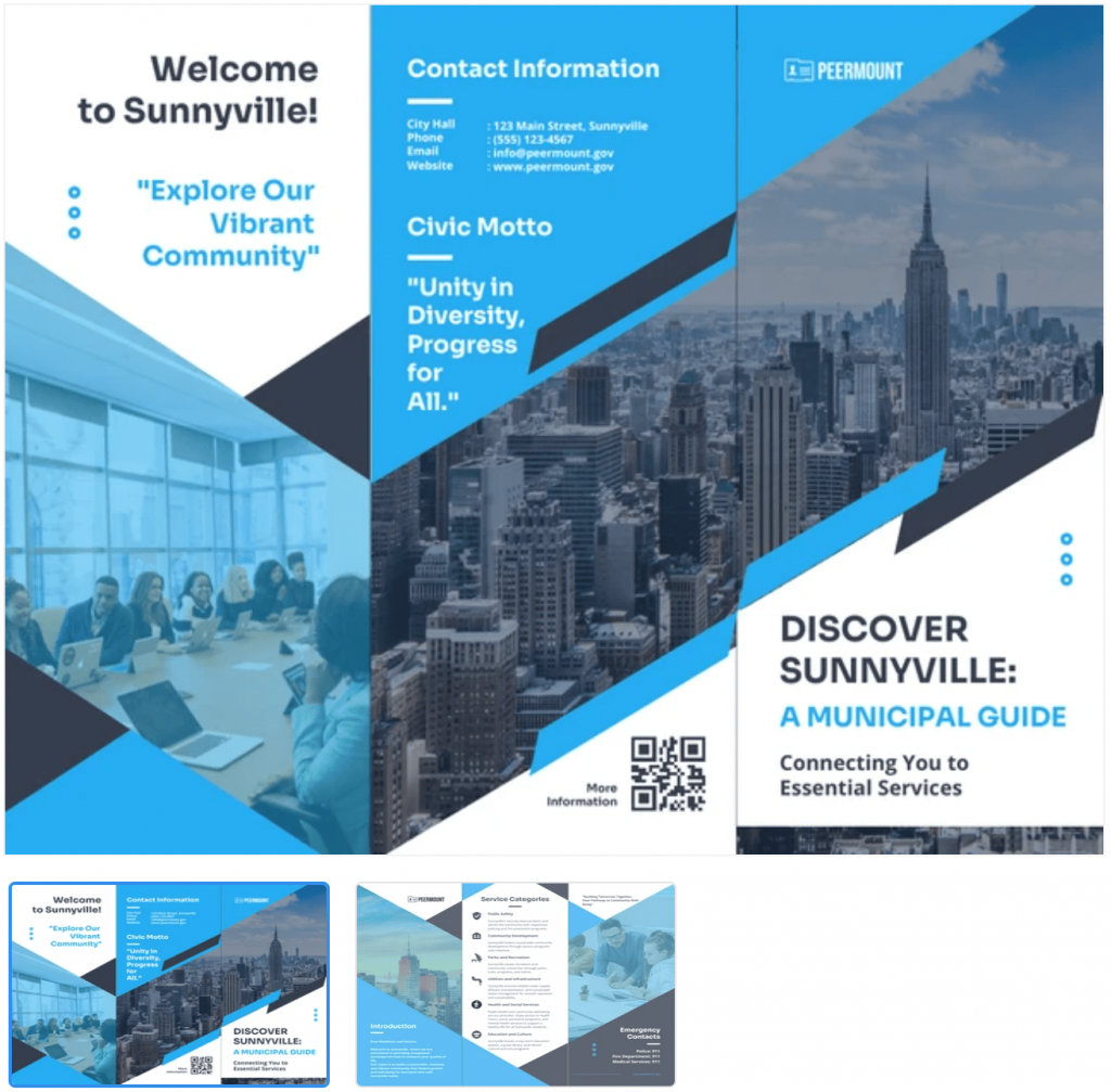
The template below, for instance, is perfect for showcasing local government services, community resources, and essential contact information in a clear, organized format:
But bi-fold brochures like the one below aren’t rare either:
It’s a perfect bi-fold brochure for consulting firms or agencies that want to present services with bright visuals and bold typography, without starting from scratch.
You shouldn’t choose between a flyer and a brochure just because one looks nicer. The right pick depends on your goal.
For example, do you want to drive a ton of foot traffic to an event next week? A flyer grabs attention quickly and costs less.
Flyer marketing can produce big results on a small budget. You can save on design costs by doing it yourself; plus printing and distribution costs are minimal.
But if you’re selling something that demands more money or time commitment, a brochure is a better bet. It builds trust with visuals, testimonials and detailed information that a flyer can’t carry.
A tattoo shop in a strip mall might hand out a flyer with a 15% discount to draw a crowd over the long weekend. But if that same shop opens a new location and wants locals invested for the long run, it’s better off sharing a multi-fold brochure with the story, menu, map and hours.
Here are some very specific scenarios for you to understand when to choose what:
Use a flyer when:
You’re announcing a local event, a sale or a limited-time offer and need to get the message out fast.
You’re working with a tight budget and need something inexpensive.
You want something that catches people’s eyes fast; people typically scan flyers in seconds.
Research shows print works better for retention than digital. For instance, 82% of people say they understand and remember information better when they read it on paper and 77% prefer print over digital.
The tactile quality of print marketing materials taps into a consumer’s touch memory, which has quickly proven to be a long-lasting form of emotional connection.
You need to educate prospects or give them something to refer back to. People don’t just skim brochures; they read them from cover to cover.
You want to showcase multiple offerings or services in detail. Brochures give you space to organize sections, highlight testimonials, add multiple visuals or elaborate on technical info.
Brochures signal seriousness and investment in quality. You’re in a trade show, client meeting or any B2B environment where people expect polished, info-rich materials.
Pamphlets, booklets and ads: What’s the difference?
Flyers and brochures get most of the attention, but they’re not the only formats people mix up. You’ve probably heard “pamphlet,” “booklet,” or even “ad” used interchangeably.
But they’re not the same thing, and knowing the difference can save you from using the wrong format (and the embarrassment that comes with it) in front of the wrong audience.
Pamphlet vs brochure vs flyer
These three terms often get lumped together. A pamphlet is essentially a small booklet without a hard cover, often folded or stapled, used to educate on one topic.
Here’s an example of a pamphlet:
This is a one-page medical brochure. And it’s ideal for clinics or other types of small businesses that want to share clear info quickly.
To reiterate, a flyer is a single sheet, quick to read, cheap to produce and often time-sensitive. A brochure is more polished, multi-panel or multi-page and usually tied to a business or brand.
Booklet
Think multi-page, usually bound marketing material designed for depth. Brands use booklets when they want to showcase a full product line, training material or detailed instructions.
Unlike the print pieces above, an ad is a placement. It can run in a magazine, on a billboard or as a digital site. Ads are single-purpose and paid for distribution, while flyers, brochures and booklets are owned assets you create and share directly.
Here’s an example of a poster ad that highlights key ingredients and benefits in a calm, inviting layout:
Knowing these differences matters because audiences react differently to each. A booklet signals authority and permanence. A flyer says ‘urgency’. An ad is fleeting and transactional. Confusing one for another doesn’t just blur your message—it wastes your budget.
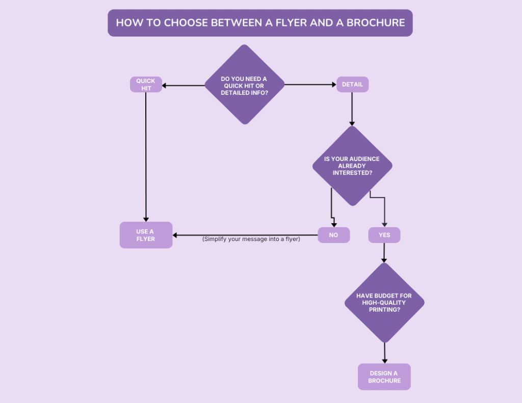
How to choose between a flyer and a brochure
Match your message with how your audience thinks and where you’ll reach them.
Message complexityFlyers win when you have one clear point. Brochures win when you need room for story, specs or proof.
Audience intentFlyers are great at grabbing attention in a crowd. Brochures thrive when people are already leaning your way and want details.
BudgetFlyers cost less to print and scale. Brochures require some investment because they use heavier paper stock, more folds and more nuanced design layout.
Distribution methodFlyers “fly” on street corners, college bulletin boards and social channels fast. Brochures perform best in formal interactions such as meetings, consultations, hotel lobbies…places usually people pause and absorb.
If you are still not sure when to use what, go through this decision tree (or create your own with Venngage) to decisively know whether a flyer or a brochure suits you best:
Let’s clear up the most common questions related to flyers vs brochures.
What should not be included in a brochure?
Avoid big blocks of text, cluttered designs, poor hierarchy and redundant details. Make sure your brochure content is focused, skimmable and visually pleasing for the readers to follow.
Is a brochure always folded?
Not always. By norm, most brochures use a tri-fold or bi-fold design. However, some are bound as multi-page booklets for more detailed content.
Are flyers print ads?
No, flyers aren’t the same as print ads. Flyers are standalone, single-sheet marketing materials. Ads are paid placements in newspapers, magazines or websites.
What is a one-page flyer called?
A one-page flyer is also called a leaflet, handbill, handout or sell sheet. All of them are designed to share quick, easy-to-digest information at low cost.
Choose the right format to make your message stick
Flyers get attention fast, while brochures build trust over time. Both have their place depending on your goal. The key is matching format with intent.
Ready to create the right one for your next marketing campaign? Start with Venngage’s free AI Flyer or Brochure Generator.
You can promote your business digitally in countless ways, but traditional marketing strategies still work wonders. Handing out flyers in person or mailing them directly to customers, putting up posters on busy streets or in storefronts — these are simple, effective ways to get noticed.
The question is, when should you use a flyer and when does a poster work better? They may seem similar, but each has its own purpose. In this guide, I’ll break down flyer vs. poster in detail. You’ll learn their key differences, where each works best and how to decide which one to use for marketing purposes.
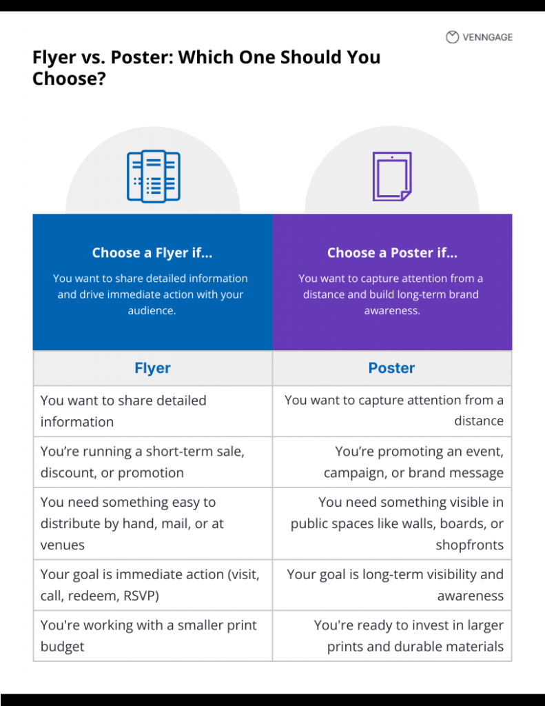
Flyer vs. poster: Key differences at a glance
Here’s a quick overview of the difference between flyers and posters:
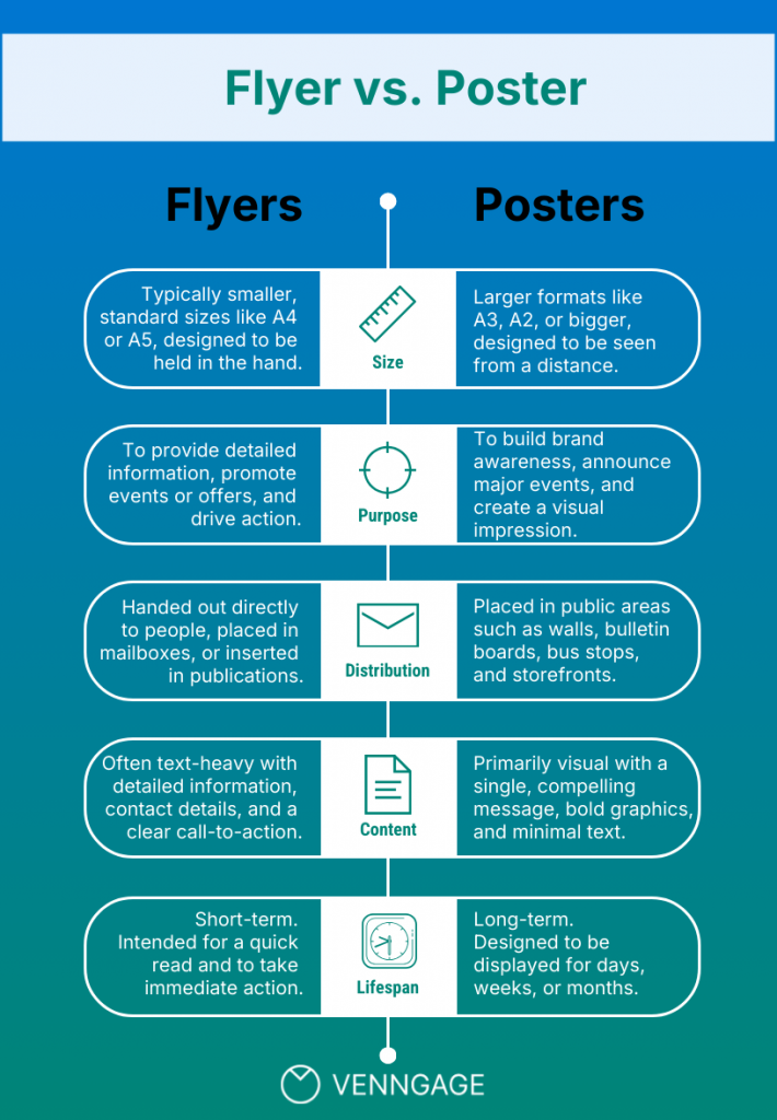
What is a flyer?
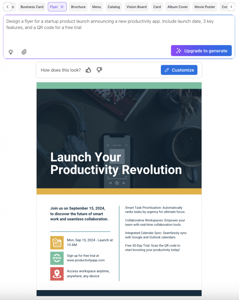
A flyer is a one-page document that shares information about your product, service, event, offers, or any upcoming activity. Its purpose is to create awareness and encourage people to take immediate action, like attending an event, redeeming an offer or contacting your business.
You’ve probably seen them everywhere. Someone hands you a colorful piece of paper outside the subway, you find one tucked under your car’s windshield wiper or it arrives in your mailbox along with the bills.
Flyers are work well in digital formats, such as PDFs or images. You can use them as social media posts and email attachments or embed them on landing pages for product or event promotion.
Research by Data and Marketing Association state that 38% of flyers are kept for at least a few days and 13% are kept for over a week. People are also most likely to keep money-off flyers for at least a week.
Attributes of a flyer
Size and format: A flyer design is usually printed on A4, A5, or half-sheet sizes. They’re compact and easy to distribute.
Distribution: You can hand out flyers directly to your customers or prospects, add them to mailers, or place them at stores, events and community spaces. They are good for targeted distribution strategies.
Design elements: A flyer usually contains more information than a poster. They can include key details about the product, service, or event. You can add dates, times, locations, contact information and a clear call-to-action. According to Next Day Flyers, “Adding QR codes, social handles or AR makes flyers more engaging and actionable.”
Cost and materials: They are usually printed on lightweight paper stock and are inexpensive.
Use cases: Flyers prove most effective for promotional marketing, discount campaigns, event promotion, product launches, menu distribution and lead generation initiatives. They work particularly well when you need an immediate response.
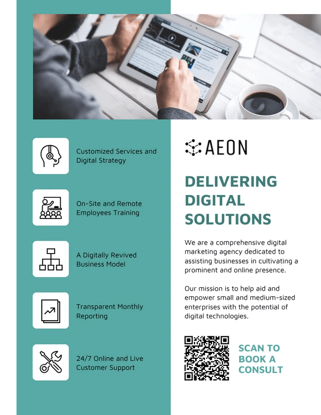
Here’s a flyer example for promoting business services. You can use this business flyer template to promote your services and add a a clear QR code CTA (Scan to Book a Consult) to encourage readers to take action.
According to research by Data and Marketing Association, 89% of people remember receiving a flyer in the mail, making it one of the most memorable forms of advertising.
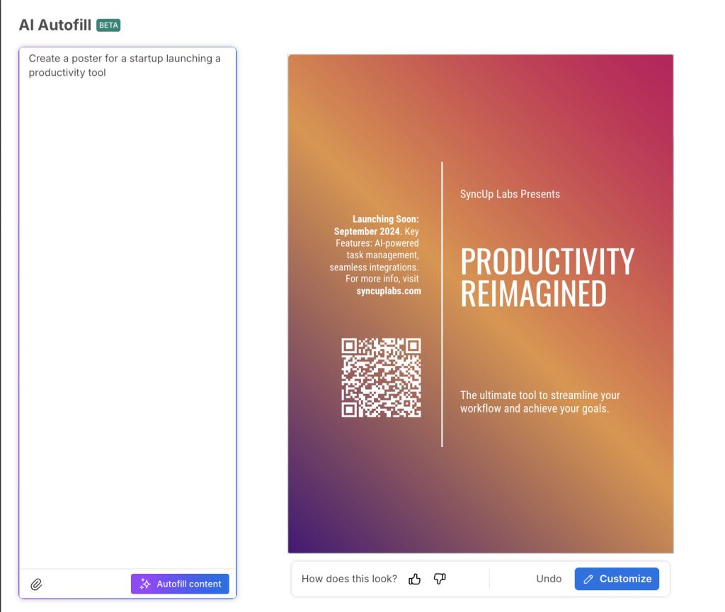
What is a poster?
A poster is a large-format printed marketing material that is used to advertise a product or service, share important information, or simply grab attention. It combines bold visuals with minimal text to convey a message quickly.
Unlike flyers, which are designed for hand distribution, posters are created to be displayed in public spaces where they can be viewed from a distance. The main purpose of a designing a poster is to attract attention, build awareness and leave a lasting visual impression on the audience.
Size and format: Posters are usually printed in large dimensions such as A3, A2, or A1, making them visible in public spaces.
Distribution: You’ll see posters on walls, boards, shopfronts and other high-traffic areas where many people can see them.
Design elements: To make your poster stand out, use bold images, striking colors and short, impactful copy. The headline or key message dominates, while details are secondary.
Cost and materials: A poster has a higher printing cost than flyers. That’s because they are often produced on thicker or durable stock to last longer on display.
Use cases: Posters work great for promoting concerts, festivals, awareness campaigns, product launches and brand advertising.
Here’s an example of a poster for an event. This template has a gradient, textured background with bold colours, a big headline to grab attention and minimal text. You can use this poster design to promote music or art events.
Here’s a real example from Slack’s Instagram promoting their event. Notice how this marketing poster keeps text to a minimum and leans on bold graphics instead. Plus, the decorative elements like confetti and geometric shapes create visual interest.
You can also check out more poster design ideas, tips and templates in this video.
Flyer vs. poster: How do they compare?
A flyer is all about direct communication and immediate action. It’s small, easy to hand out or share digitally and packed with the specific details people need to make decisions. The goal is to get someone to act right away — show up at an event, use a coupon or sign up for a service.
A poster works differently. It’s built for maximum visibility and long-term awareness. Posters are designed to be noticed from a distance, which is why they use bold visuals and minimal text. Instead of providing every detail, they grab attention quickly and build brand recognition that sticks over time.
The design strategies for flyers and posters fundamentally differ because they serve distinct marketing objectives.
Flyers are built for detailed communication. Since people hold them close and have time to read, the design can accommodate smaller fonts, multiple information sections and comprehensive details. The challenge is balancing information density with visual appeal to avoid overwhelming readers while providing everything they need to take action.
Posters operate on the “three-second rule.” They must communicate their core message before someone walks past. This requires strategic visual hierarchy with bold headlines, striking imagery and minimal supporting text. Every design element serves the goal of instant recognition and memorable impact.
The fundamental difference: flyers function as detailed guides, while posters work as visual magnets.
Typography: Flyers can use smaller fonts because they are read up close. They combine multiple font weights and sizes to separate headlines, body copy and contact details. Posters, on the other hand, require large, bold typography that can be read from a distance in just a few seconds.
Visual hierarchy: There’s often a clear visual hierarchy in flyers — headline at the top, supporting details in the middle and the call-to-action at the bottom. A poster uses hierarchy differently, often relying on one dominant visual or headline supported by minimal text, so the message is instantly clear.
Readability distance: Flyers are designed for close reading, which allows them to carry dense information in smaller fonts. Posters are designed for far viewing, so the design must be simplified, with short text and strong imagery that stands out.
Density of information: Flyers usually pack in more content: dates, times, locations, offers and contact details. The goal is to give readers everything they need to act. Posters focus on a single message or idea. Too much information reduces their impact.
Branding: Flyers include detailed brand elements such as logos, color palettes, contact information and sometimes even secondary graphics or icons. Posters emphasize brand recognition through strong visuals and consistent use of colors or logos but keep supporting details minimal.
Calls-to-Action (CTA): Flyers almost always include a specific CTA — “Visit our website,” “Scan this QR code,” “Call to register.” Posters may include a CTA, but often the goal is awareness first and action second. A typical poster CTA is short and visual, like a URL or hashtag.
Imagery: Flyers use imagery to support information (product photos, service visuals, event snapshots). Posters rely heavily on imagery as the main communication tool — a striking photo or graphic often is the message.
Layout flexibility: Flyers can have multiple sections and a denser layout. Posters need more negative space so the central message doesn’t get lost in clutter.
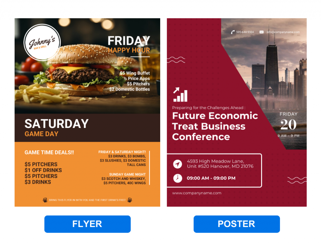
Let’s compare flyer vs. poster using examples:
The flyer design on the left uses classic direct marketing principles. Notice how it’s packed with specific value propositions like “$5 Wing Buffet,” “½ Price Apps,” and exact pricing for different game day specials. There’s substantial text, multiple offers and detailed terms at the bottom. This information-dense layout assumes someone will hold it close and actually read through the details.
The event poster design on the right takes the opposite approach, focusing on brand awareness and visual impact. The main message “Future Economic Treat Business Conference” uses bold typography to grab attention from a distance.
You can also see the practical differences in how they handle information hierarchy.
The flyer uses multiple sections, bullet points and detailed pricing because someone receiving it has time to process all that information.
The poster keeps it simple with just the essential details because viewers might only have a few seconds to notice the message.
How to design flyers and posters?
Creating professional flyer designs and poster layouts doesn’t require extensive design experience or starting with a blank canvas.
Just add your marketing objectives, key messaging and basic content details. The tool analyzes your requirements and creates multiple layout options optimized for your specific format. You can then customize the AI-powered flyers or posters with your brand colors, logos, imagery and call-to-action elements to match your business identity.
Here’s how to do it:
If you want more hands-on control, you can also create the design using a template. Venngage offers hundreds of customizable flyer designs and poster templates across different categories. Pick one that aligns with your theme and use the AI Autofill feature to create a custom design within seconds.
When to use flyers and posters for marketing purposes?
From a marketing perspective, flyers and posters fulfill different roles in the campaign funnel.
Flyers excel in conversion-focused marketing. They work best when you need direct response and measurable action from your audience. Think discount codes, QR codes linking to landing pages, detailed event information, or product demonstrations.
The format is designed to be retained, referenced and shared, making flyers ideal for promotional campaigns and lead generation initiatives.
According to the American Marketing Association, “Flyers are a straightforward and budget-friendly marketing technique that involves distributing printed advertisements in targeted areas. This approach, often referred to as ‘carpet-bombing,” allows businesses to reach a wide audience quickly.”
Posters, on the other hand, are more awareness-driven. Their purpose isn’t to communicate every detail but to leave a strong impression. Whether it’s a festival lineup, a new product launch, or a social awareness campaign, posters are about making people stop, notice and remember.
In practice, the smartest campaigns use both formats together. For example, a SaaS company launching a new platform could display posters in co-working spaces with a bold headline like “Work Smarter with [Product Name]” while distributing flyers at industry events with product details and a QR code to start a free trial. The poster builds recognition; the flyer drives action.
Here’s a quick checklist on when to use a poster vs. a flyer.
Yes. A flyer is a form of advertising because it promotes a product, service, or event to a target audience. It can be printed or digital and its purpose is to raise awareness and drive action — whether that’s attending an event, redeeming a coupon, or signing up for a service.
2. Which is more cost-effective: flyers or posters?
Flyers are generally more cost-effective. They are smaller, cheaper to print in bulk and easier to distribute by hand or digitally. Posters are larger, use more material and are often printed on higher-quality stock to withstand display, which makes them more expensive per unit.
3. What are the disadvantages of flyers?
Flyers are short-lived — many are discarded quickly after being handed out. They have limited reach compared to posters because distribution relies on one-to-one contact. Flyers can also look cluttered if overloaded with information, which reduces their effectiveness.
4. What is the main difference between a flyer and a poster?
A flyer is small, detail-oriented and designed for close reading and immediate action. A poster is large, visual and designed to grab attention from a distance and build awareness.
5. Can flyers and posters be used together?
Yes. Many campaigns combine them. Posters create buzz and visibility in public spaces, while flyers provide details and a direct way for people to take action.
6. Which is better for event promotion: a flyer or a poster?
Posters are better for building awareness and visibility, while flyers are better for sharing event details and nudging people to RSVP or attend. For maximum impact, both should be used together.
Create flyers and posters with Venngage
Flyers and posters are not interchangeable. Each format has its own strength and the right choice depends on whether you need to drive immediate action or build long-term awareness.
A flyer helps you share detailed information and push a response right away. With a poster, you can capture attention and make your message memorable in public or digital spaces.
With Venngage, you can create both flyers and posters quickly using professional templates. The drag-and-drop editor and AI-powered design suggestions make the process simple, so you spend less time fiddling with layouts and more time creating materials that stick with your audience.